Predicting Free Public WiFi Locations in Seoul with Point Process Models using Foursquare API
Posted on June 25 2017 in Spatial Statistics
Introduction
The field of spatial statistics is experiencing a period of rapid growth, though less so compared to that of machine learning and artificial intelligence, with the onset of location technology and efficient solution techniques for high performance computing, which has begun to replace classical frequentist inference procedures developed years ago with Bayesian methods.
A point process, in particular, is a special kind of stochastic process where each \(X_i\) is the numeric representation of a point location in space, usually planar. Diggle (2013) puts it nicely: "A spatial point pattern is a set of locations, irregularly distributed within a designated region and presumed to have been generated by some form of stochastic mechanism (p. xxix)". The equivalent of a linear model in spatial statistics is a point process model that takes into account spatial coordinates of points and geographical features.
In this post, I'm going to fit point process models on the dataset of free public WiFi locations in Seoul, Korea downloaded from Seoul Open Data Plaza and predict the probability of seeing a free public WiFi at a given location within Seoul using location data grabbed from the Foursquare API.
WiFi Location Dataset
The dataset seoul-public-wifi-cleaned.csv consists of 2385 spatial points with 6 columns that are the name of the place where a free public WiFi is installed, xy-coordinate (longitude and latitude) of the place, WiFi network provider, municipal unit, and location type. Each point can be one of 3 WiFi network providers: KT, SKT, and LGU+ and one of 12 location types: bus stops, community centers, cultural facilities, health facilities, main streets, parks, plazas, public institutions, tourist destinations, traditional markets, walking trails, and welfare facilities.
library(RCurl)
library(jsonlite)
library(plyr)
library(data.table)
library(rgdal)
library(spdep)
library(splancs)
library(spatstat)
library(ggmap)

wifi <- fread("seoul-public-wifi-cleaned.csv")
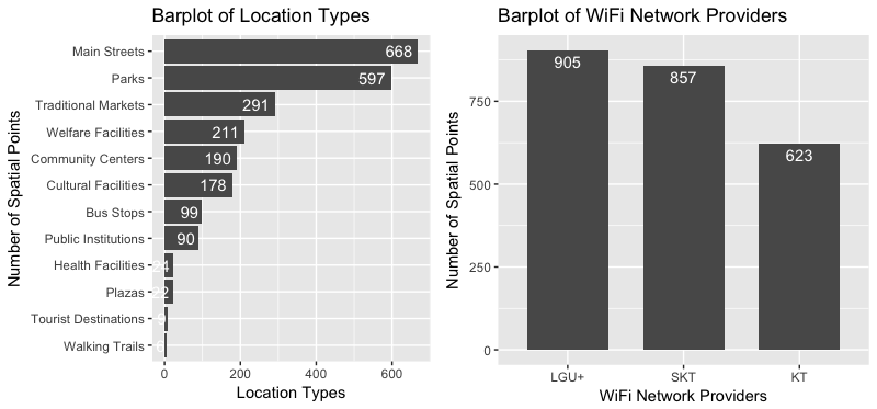
The distribution of WiFi network providers and that of location categories are plotted as follows. I borrowed the multiplot function to plot two graphs in a single window. About 55% of free public WiFis are located in the main streets and parks. WiFi network providers SKT and LGU+ serve nearly 75% of the locations.
w1 <- wifi[, .N, cat][order(-N)]
w2 <- wifi[, .N, comp][order(-N)]
w1$cat <- factor(w1$cat, levels = rev(as.character(w1$cat)))
w2$comp <- factor(w2$comp, levels = as.character(w2$comp))
p1 <- ggplot(data = w1, aes(x = cat, y = N)) +
  geom_bar(stat = "identity") + coord_flip() +
  geom_text(aes(label = N), position = position_dodge(width = 0.9), hjust = 1.2, colour = "white") +
  labs(x = "Number of Spatial Points", y = "Location Types", title = "Barplot of Location Types")
p2 <- ggplot(data = w2, aes(x = comp, y = N)) +
  geom_bar(stat = "identity", width = 0.7) +
  geom_text(aes(label = N), position = position_dodge(width = 0.9), vjust = 1.5, colour = "white") +
  labs(x = "WiFi Network Providers", y = "Number of Spatial Points", title = "Barplot of WiFi Network Providers")
multiplot(p1, p2, cols = 2)
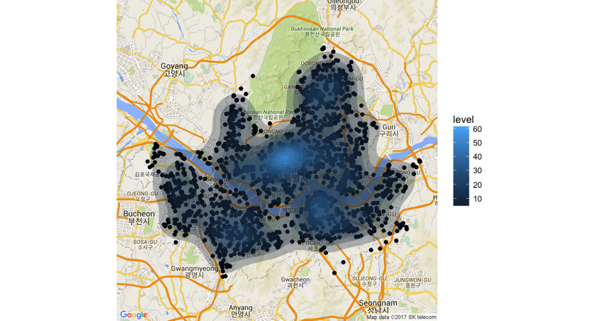
Spatially join the points with the Seoul municipalities shapefile seoul_municipalities.shp and plot the points on top of the municipality boundaries (not shown). Plot the points and contours of a 2D kernel density estimate on the actual geographical map of Seoul.
shape <- readOGR("seoul_municipalities.shp")
plot(shape)

kt.list <- list()
for (i in 1:length(shape@polygons)) {
  kt <- shape@polygons[[i]]@Polygons[[1]]@coords
  kt.list[[i]] <- kt
}

kt.list <- do.call(rbind, kt.list)

wifi.pts <- as.points(wifi$lng, wifi$lat)
wifi.poly <- as.points(kt.list[,1], kt.list[,2])
wfppp <- ppp(wifi.pts[,1], wifi.pts[,2],
             xrange = range(wifi.poly[,1]),
             yrange = range(wifi.poly[,2]))

par(mfrow = c(1,1))
plot(wifi.pts[,1], wifi.pts[,2], pch = 20, cex = 1.2)
polymap(wifi.poly, add = TRUE)

seoul_map <- qmap('seoul', zoom = 11, maptype = 'roadmap')
q <- seoul_map +
  geom_point(data = wifi, aes(x = lng, y = lat)) +
  geom_polygon(data = wifi,
               aes(x = lng, y = lat, fill = ..level..),
               stat = 'density2d',
               alpha = 0.3)
plot(q)
Do the points look clustered, regular, or random? A clustered process means that events, or actual observations, fall into clumped groupings, whereas in a regular process, there are regular spatial intervals between events i.e. if species are pushing against each other by inhibiting growth at too close a distance. Events follow a completely spatially random pattern when they are equally likely to occur at any location within the defined region \(R\). The CSR serves as the baseline for comparison of clustered and regular point processes.
Given a CSR, events follow a uniform distribution over the study region \(R\):
for all \((x, y) \in R\), where \(|R|\) is the area of \(R\). Events are independent. Note that since the area of \(R\) may vary widely, it’s sometimes more helpful to think that the average number of points per unit area is some fixed, constant \(\lambda\) (lambda). This number is called the intensity, or equivalently, the mean.
Poisson distributions are used to model the number of events per unit of space or time. The mean and the variance of a Poisson distribution are all equal to \(\lambda\). A homogeneous Poisson point process is defined as follows:
- The random number of events \(X\) in a finite region \(A\) has a Poisson distribution with mean \(\lambda|A|\) where \(|A|\) is the area of \(A\) and \(\lambda\) is the intensity.
Intensity is the number of expected events per unit area. For a homogeneous process, this is constant over the area.
- Given that a total of \(X = N\) events occur in \(A\), the locations of the events are uniformly distributed across \(A\).
This means that for a CSR, while the observed number of points over a region \(R\) will vary from one realization to the next, the average (expected) number of points is the fixed quantity \(\lambda|R|\). We can therefore generate a CSR:
- Generate a Poisson number of points \(X = N\) with mean \(\lambda|R|\).
- Randomly assign locations for the \(N\) according to a uniform distribution.
Under the homogeneous Poisson model, the intensity function \(\lambda\) is constant. However, for many processes, a constant risk hypothesis is too restrictive - the intensity varies over a region according to population, gradients, etc. Hence we define a heterogenous Poisson point process with intensity function \(\lambda(s)\) where \(s\) is any point in our study region \(R\), using the criteria:
- The number of events in any region \(A \subset R\) has a Poisson distribution with mean \(\int_A \lambda(s)~ds\).
- Given that a total of \(X = N\) events occur in \(A\), the locations of the events are a random sample of \(N\) events sampled proportional to \(\lambda(s)\).
Let's use the Clark-Evans test to examine whether the points follow a completely spatially random pattern.
clarkevans.test(wfppp)
clarkevans.test(wfppp, alternative = "clustered")
Since the p-value is less than 0.05, we reject the null hypothesis that the WiFi locations are completely spatially randomly distributed within Seoul. In fact, the earlier contour plot indicates that points are rather clustered near the center of Seoul where we expect to see a lot of foot traffic.
K, L, G, F, J Functions
Surely the points are not CSR but may rather be clustered. Is this clustering of points perhaps due to changing mean \(\lambda\) or spatial correlation over the region? Can we check this departure from CSR graphically? Several measures exist to achieve these: nearest neighbor methods such as the \(G\) and \(F\) functions. However, most common and popular is the Ripley's \(K\) function.
The \(K\) function \(K(r)\) measures the expected number of events within distance \(r\) of a random event divided by \(\lambda\). Under CSR, \(K(r) = \pi r^2\) which is a parabola. If regular, \(K(r) < \pi r^2\) for \(r\) less than regularity interval; if clustered, \(K(r) > \pi r^2\) for \(r\) less than cluster size.
The \(L\) function \(L(r)\) is \(\sqrt{\dfrac{K(r)}{\pi}} - r\) which is a transformation of \(K(r)\) so that it'd be easier to note departures from CSR if what was normal was a straight line, not a parabola.
On the other hand, the \(G\) function \(G(r)\) is the cumulative probability distribution of nearest neighbor distances between events. The \(F\) function \(F(r)\) is the cumulative probability distribution of nearest neighbor distances from a random point to an event. Remember that an event is an actual observation in region \(R\), but a point is any other location of interest in the region. The \(J\) function \(J(r)\) is just \(\dfrac{1 - G(r)}{1 - F(r)}\). My R code below plots all these functions with various border correction methods.
# K function
Kplot <- function(envdata, Kdata, x = 1, y = 1, datatitle = "Data") {
  dataenv <- envdata
  dataK <- Kdata
  plrange <- range(c(dataK$border[is.finite(dataK$border)],
                     dataK$trans[is.finite(dataK$trans)],
                     dataK$iso[is.finite(dataK$iso)],
                     dataenv$lo[is.finite(dataenv$lo)],
                     dataenv$hi[is.finite(dataenv$hi)]))
  pllength <- max(length(dataK$border[is.finite(dataK$border)]),
                  length(dataK$trans[is.finite(dataK$trans)]),
                  length(dataK$iso[is.finite(dataK$iso)]))
  par(pty = "m")
  plot(dataenv$r[1:pllength], dataenv$obs[1:pllength], pch = "",
       main = paste("Ripleys K-plot for", datatitle), ylim = plrange, xlab = "Distance (h)", ylab = "Ripley's K")
  lines(dataenv$r, dataenv$hi, lty = 2, col = "Red", lwd = 2)
  lines(dataenv$r, dataenv$lo, lty = 2, col = "Red", lwd = 2)
  lines(dataK$r, dataK$theo, lty = 1, col = "Black", lwd = 2)
  lines(dataK$r, dataK$border, lty = 1, col = "Yellow", lwd = 2)
  lines(dataK$r, dataK$trans, lty = 1, col = "Green", lwd = 2)
  lines(dataK$r, dataK$iso, lty = 1, col = "Blue", lwd = 2)
  legend(x, y, c("CSR", "Boundaries", "Border Corrected", "Trans Corrected", "Iso Corrected"),
         lty = c(1,2,1,1,1), col = c("Black", "Red", "Yellow", "Green", "Blue"),
         lwd = c(2,2,2,2,2), cex = 0.5)
}

# L function
L <- function(envdata, Kdata, x = 1, y = 1, datatitle = "Data") {
  dataenv <- envdata
  dataK <- Kdata
  dataenv$obs <- sqrt(dataenv$obs/pi) - dataenv$r
  if (is.null(dataenv$theo) == FALSE) {
    dataenv$theo <- sqrt(dataenv$theo/pi) - dataenv$r
  } else {
    dataenv$theo <- sqrt(dataenv$mmean/pi) - dataenv$r
  }
  dataenv$lo <- sqrt(dataenv$lo/pi) - dataenv$r
  dataenv$hi <- sqrt(dataenv$hi/pi) - dataenv$r
  dataK$theo <- sqrt(dataK$theo/pi) - dataK$r
  dataK$border <- sqrt(dataK$border/pi) - dataK$r
  dataK$trans <- sqrt(dataK$trans/pi) - dataK$r
  dataK$iso <- sqrt(dataK$iso/pi) - dataK$r
  plrange <- range(c(dataK$border[is.finite(dataK$border)],
                     dataK$trans[is.finite(dataK$trans)],
                     dataK$iso[is.finite(dataK$iso)],
                     dataenv$lo[is.finite(dataenv$lo)],
                     dataenv$hi[is.finite(dataenv$hi)]))
  pllength <- max(length(dataK$border[is.finite(dataK$border)]),
                  length(dataK$trans[is.finite(dataK$trans)]),
                  length(dataK$iso[is.finite(dataK$iso)]))
  par(pty = "m")
  plot(dataenv$r[1:pllength], dataenv$obs[1:pllength], pch = "",
       main = paste("L-plot for", datatitle), ylim = plrange, xlab = "Distance (h)",
       ylab = "sqrt(K/pi)-h")
  lines(dataenv$r, dataenv$hi, lty = 2, col = "Red", lwd = 2)
  lines(dataenv$r, dataenv$lo, lty = 2, col = "Red", lwd = 2)
  lines(dataK$r, dataK$theo, lty = 1, col = "Black", lwd = 2)
  lines(dataK$r, dataK$border, lty = 1, col = "Yellow", lwd = 2)
  lines(dataK$r, dataK$trans, lty = 1,col = "Green", lwd = 2)
  lines(dataK$r, dataK$iso, lty = 1, col = "Blue", lwd = 2)
  legend(x, y, c("CSR", "Boundaries", "Border Corrected", "Trans Corrected", "Iso Corrected"),
         lty = c(1,2,1,1,1), col = c("Black", "Red", "Yellow", "Green", "Blue"),
         lwd = c(2,2,2,2,2), cex = 0.5)
}

# G function
G <- function(envdata, Kdata, datatitle) {
  dataenv <- envdata
  dataK <- Kdata
  pllength <- max(length(dataK$rs[is.finite(dataK$rs)]),
                  length(dataK$km[is.finite(dataK$km)]),
                  length(dataK$theo[is.finite(dataK$theo)]))
  xlim1 <- range(dataK$r[dataK$km<1]) * 1.25
  xlim2 <- range(dataK$r[dataK$r<1]) * 1.25
  xlims <- range(xlim1, xlim2)
  par(pty = "m")
  plot(dataenv$r[1:pllength], dataenv$obs[1:pllength], pch = "",
       main = paste("G-plot for", datatitle), xlim = xlims, ylim = c(0,1), xlab = "Distance (r)", ylab = "G(r)")
  lines(dataenv$r, dataenv$hi, lty = 2, col = "Red", lwd = 2)
  lines(dataenv$r, dataenv$lo, lty = 2, col = "Red", lwd = 2)
  lines(dataK$r, dataK$theo, lty = 1, col = "Black", lwd = 2)
  lines(dataK$r, dataK$rs, lty = 1, col = "Yellow", lwd = 2)
  lines(dataK$r, dataK$km, lty = 1, col = "Green", lwd = 2)
  lines(dataK$r, dataK$han, lty = 1, col = "Blue", lwd = 2)
  legend(0, 1, c("CSR", "Boundaries", "Border Corrected", "KM Corrected", "Hanish"),
         lty=c(1,2,1,1,1), col = c("Black", "Red", "Yellow", "Green", "Blue"),
         lwd=c(2,2,2,2,2), cex = 0.5)
  par(pty="s")
}

# F function
Ffunc <- function(envdata, Kdata, datatitle) {
  dataenv <- envdata
  dataK <- Kdata
  pllength <- max(length(dataK$rs[is.finite(dataK$rs)]),
                  length(dataK$km[is.finite(dataK$km)]),
                  length(dataK$theo[is.finite(dataK$theo)]))
  xlim1 <- range(dataK$r[dataK$km<1]) * 1.25
  xlim2 <- range(dataK$r[dataK$r<1]) * 1.25
  xlims <- range(xlim1, xlim2)
  par(pty = "m")
  plot(dataenv$r[1:pllength], dataenv$obs[1:pllength], pch = "",
       main=paste("F-plot for", datatitle), xlim = xlims, ylim = c(0,1), xlab = "Distance (r)", ylab = "F(r)")
  lines(dataenv$r, dataenv$hi, lty = 2, col = "Red", lwd = 2)
  lines(dataenv$r, dataenv$lo, lty = 2, col = "Red", lwd = 2)
  lines(dataK$r, dataK$theo, lty = 1, col = "Black", lwd = 2)
  lines(dataK$r, dataK$rs, lty = 1, col = "Yellow", lwd = 2)
  lines(dataK$r, dataK$km, lty = 1, col = "Green", lwd = 2)
  lines(dataK$r, dataK$cs, lty = 1, col = "Blue",lwd = 2)
  legend(0, 1, c("CSR", "Boundaries", "Border Corrected", "KM Corrected", "Chiu-Stoyan"),
         lty = c(1,2,1,1,1), col = c("Black", "Red", "Yellow", "Green", "Blue"),
         lwd = c(2,2,2,2,2), cex = 0.5)
  par(pty = "s")
}

# J function
Jfunc <- function(envdata, Kdata, datatitle, xlims, ylims, legend) {
  dataenv <- envdata
  dataK <- Kdata
  pllength <- max(length(dataK$rs[is.finite(dataK$rs)]),
                  length(dataK$km[is.finite(dataK$km)]),
                  length(dataK$theo[is.finite(dataK$theo)]))
  par(pty = "m")
  plot(dataenv$r[1:pllength], dataenv$obs[1:pllength], pch = "",
       main = paste("J-plot for", datatitle), xlim = xlims, ylim = ylims, xlab = "Distance (r)", ylab = "J(r)")
  lines(dataenv$r, dataenv$hi, lty = 2, col = "Red", lwd = 2)
  lines(dataenv$r, dataenv$lo, lty = 2, col = "Red", lwd = 2)
  lines(dataK$r, dataK$theo, lty = 1, col = "Black", lwd = 2)
  lines(dataK$r, dataK$rs, lty = 1, col = "Yellow", lwd = 2)
  lines(dataK$r, dataK$km, lty = 1, col = "Green", lwd = 2)
  lines(dataK$r, dataK$han, lty = 1, col = "Blue", lwd = 2)
  legend(legend[1], legend[2], c("CSR", "Boundaries", "Border Corrected", "KM Corrected", "Hanish Corrected"),
         lty = c(1,2,1,1,1), col = c("Black", "Red", "Yellow", "Green", "Blue"),
         lwd = c(2,2,2,2,2), cex = 0.5)
  par(pty = "s")
}

# Plot K, L, G, F, J functions
wf.env <- envelope(wfppp, fun = Kest)
wf.K <- Kest(wfppp)
Kplot(wf.env, wf.K, datatitle = "Wi-Fi Locations")
L(wf.env, wf.K, datatitle = "Wi-Fi Locations")

wf.env <- envelope(wfppp, fun = Gest)
wf.G <- Gest(wfppp)
G(wf.env, wf.G, "G")

wf.env <- envelope(wfppp, fun = Fest)
wf.F <- Fest(wfppp)
Ffunc(wf.env, wf.F, "F")

wf.env <- envelope(wfppp, fun = Jest)
wf.J <- Jest(wfppp)
Jfunc(wf.env, wf.J, xlims = c(0, 0.03), ylims = c(0,2), datatitle = "J")
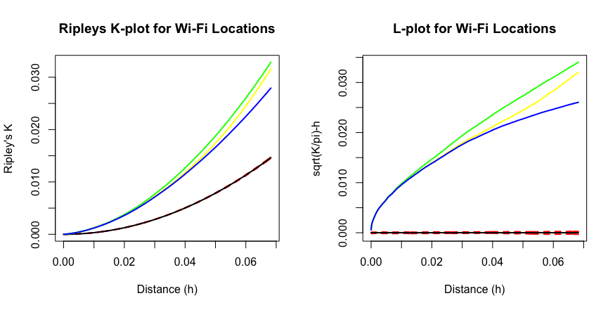
From the \(K\) and the \(L\) plots, all the colored lines are well above the black and the dotted ones, which represents the CSR baseline, so the points are indeed clustered. Different color corresponds to different border correction methods. Plots of other functions \(G\), \(F\), and \(J\) (not shown) also indicate a clustered process.
Marked Point Process
Since each spatial point is marked by two factors: WiFi network providers and WiFi location types, we have a marked point process. Each point has an associated attribute which could be categorical (species, disease status), or continuous (diameter). We can examine relationships between a particular group and all other groups i.e. multi-group comparison.
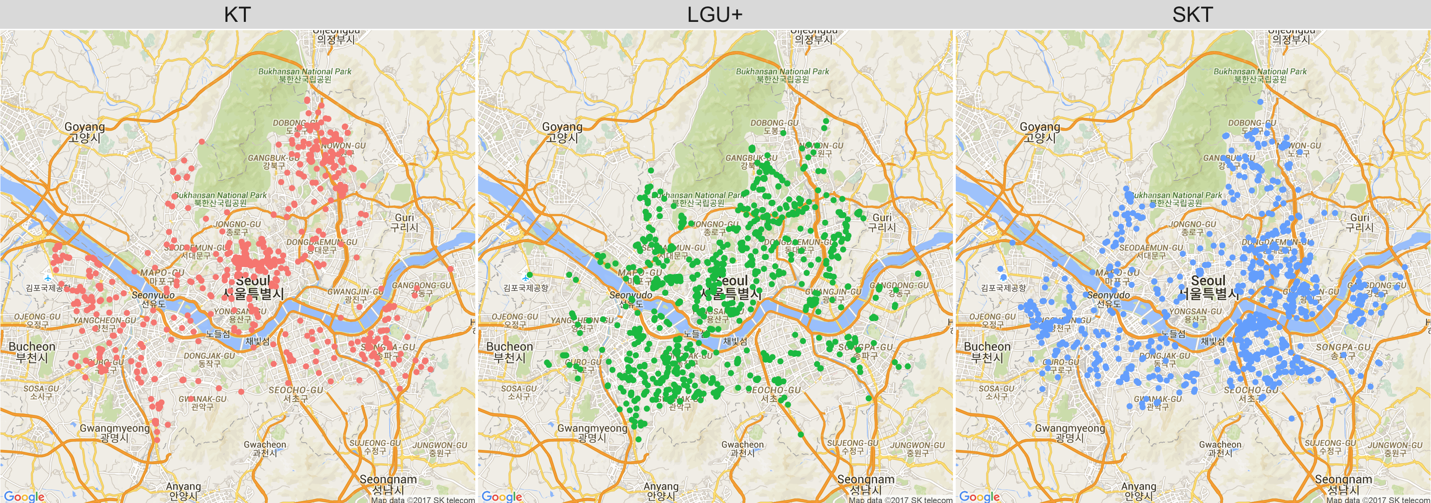
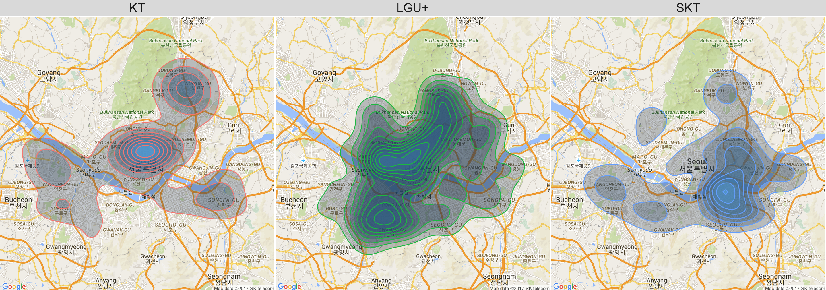
Here we observe that KT WiFi locations are mainly concentrated near the north of the river, while SKTs are concentrated near the south of the river. LGU+ covers a wider range around the center of Seoul.
q1 <- seoul_map +
  geom_points(data = wifi,
              aes(x = lng, y = lat))
q2 <- seoul_map +
  geom_polygon(data = wifi,
               aes(x = lng, y = lat, fill = ..level..),
               stat = 'density2d',
               alpha = 0.3) +
  facet_wrap(~comp)
plot(q1)
plot(q2)
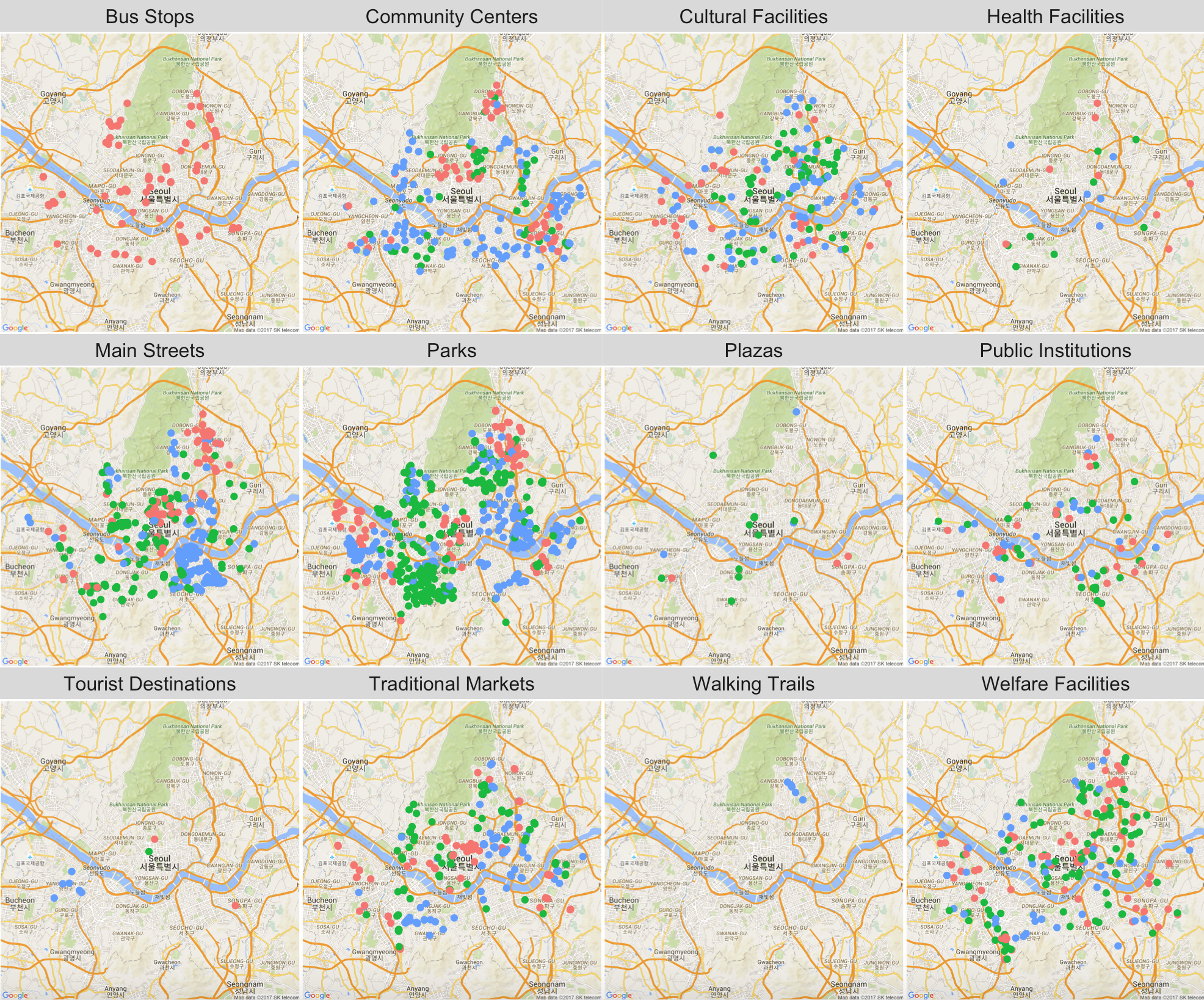
Plotting the points by location types, we observe that KT WiFis are exclusively near bus stops, while SKT and LGU+ dominate near main streets and parks. Note that the red dots refer to KT locations, greens LGU+s, and blue dots SKTs.
q3 <- seoul_map +
  geom_point(data = wifi, aes(x = lng, y = lat, colour = comp)) +
  facet_wrap(~cat)
plot(q3)
The point process of free public WiFi locations in Seoul is actually a combination of points in several groups. Each point is marked - that is, we have a marked point process. There are two marks: WiFi network providers with 3 levels: KT, SKT, and LGU+, and WiFi location types with 12 levels. In a multiple point process, we can compare density estimates as well as plot multi-group versions of the \(K\), \(L\), \(G\), \(F\), and \(J\) functions.
# Marked point process
wfact <- as.factor(wifi$comp)
wfdot.ppp <- ppp(wifi.pts[,1], wifi.pts[,2],
                 xrange = range(wifi.poly[,1]),
                 yrange = range(wifi.poly[,2]),
                 marks = wfact)
plot(split(wfdot.ppp), chars = 16)
plot(density(split(wfdot.ppp)), chars = c(16:18), ribbon = FALSE)
For many point processes, CSR is not the appropriate null hypothesis. Events will appear to be not CSR simply because the events follow a heterogenous Poisson point process that mirrors, say, population. For instance, disease or crime events will simply follow the population distribution or multiple tree species simply group by more favorable soil or climate conditions.
In this case, we need to correct for the underlying intensity function. The basic idea is to compare the intensity function of cases to that of a chosen baseline of control. This comparison is done by computing a kernel intensity estimate for each group over the same region \(R\). A ratio of estimates is then calculated and plotted. This method requires that the intensity functions be normalized to have total area under the curve equal to 1. That is, we use density functions instead of intensity functions in the ratio. The ratio of density estimates, or so called relative risk, is expressed as relative probabilities rather than relative intensities, but the interpretation is similar.
# Relative risk
mainerr <- relrisk(wfdot.ppp)
plot(mainerr, main = "Relative Risk by WiFi Network Providers")
plot(im.apply(mainerr, which.max), main = "Most Common WiFi Network Providers")
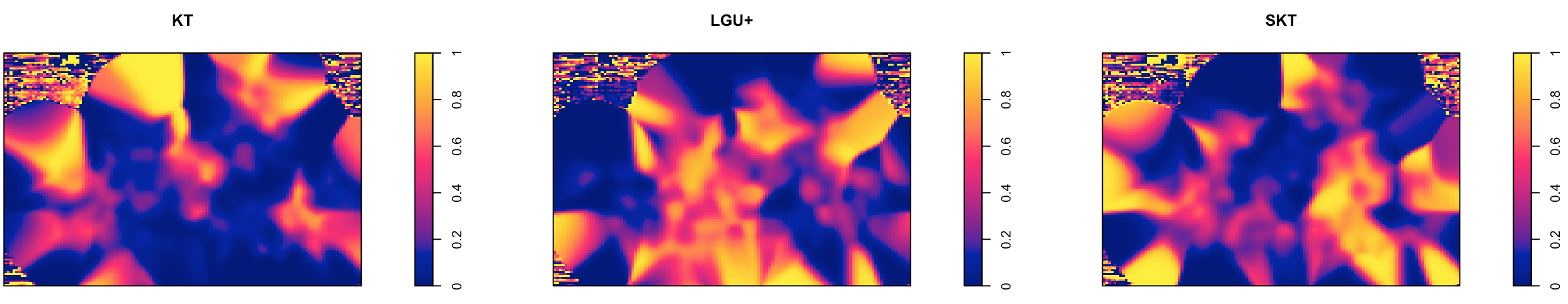
For KT, the density is higher near the upper outskirts of Seoul, whereas the density for LGU+ is concentrated near the center and SKT near the lower right.
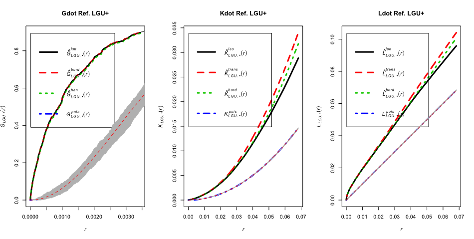
Plot multi-group versions of the \(K\), \(L\), and \(G\) functions. Each function makes a one-to-many comparison. As an example, the R code below sets the baseline control to be LGU+. The points are clustered as well even when compared to a different baseline than CSR.
# Plot Gdot, Kdot, and Ldot from one to many
par(mfrow = c(1,3))
plot(Gdot(wfdot.ppp, "LGU+"), lwd = 3, main = "Gdot Ref. LGU+")
env <- envelope(wfdot.ppp, fun = Gdot, i = "LGU+", nsim = 99)
plot(env, add = TRUE)

plot(Kdot(wfdot.ppp, "LGU+"), lwd = 3, main = "Kdot Ref. LGU+")
env <- envelope(wfdot.ppp, fun = Kdot, i = "LGU+", nsim = 20)
plot(env, add = TRUE)

plot(Ldot(wfdot.ppp, "LGU+"), lwd = 3, main = "Ldot Ref. LGU+")
env <- envelope(wfdot.ppp, fun = Ldot, i = "LGU+", nsim = 20)
plot(env, add = TRUE)
Foursquare Data
My hypothesis is there may be a correlation between the popularity of the area near the location of a free public WiFi in Seoul and the location itself. The more popular the area, the higher the chance of seeing a free public WiFi. Otherwise, what's the point of setting up one if no one will use it?
How should we define the metric of popularity? Where do we get the data? Foursquare is a location-based social network that has gathered a wealth of location and foot traffic data from its users. I'm going to retrieve the data on places within a predefined region of each WiFi location and roughly estimate the popularity as the total number of checkins, users, and tips. The more often Foursquare users check into a place, the more likely there may be a free public WiFi nearby.
First, get your own client ID and client secret from the Foursquare API page by signing up. Then, for every free public WiFi location coordinate - that is, for every pair of latitude and longitude of our data wifi from above, grab up to 50 different locations (latitude and longitude) within the radius of 400m and their business names, business categories, total number of checkins, total number of users, and total number of tips. Iterate until no additional locations are returned. By doing this, we are basically getting the popularity of every possible place in Seoul. Refer to my R code below.
client_id <- "USE_YOUR_OWN_CLIENT_ID"
client_secret <- "USE_YOUR_OWN_CLIENT_SECRET"

starttime <- Sys.time()
dat <- llply(1:nrow(wifi), function(r) {
  lats <- wifi$lat
  lngs <- wifi$lng
  lat <- as.numeric(lats[r])
  lng <- as.numeric(lngs[r])
  ll <- paste0(lat, ",", lng)
  url <- paste0("https://api.foursquare.com/v2/venues/search?ll=", ll, "&radius=", 400,
                "&client_id=", client_id, "&client_secret=", client_secret,
                "&limit=50&intent=browse&v=20160101&m=foursquare")
  output <- getURL(url)
  vdata <- fromJSON(output)
  vv <- vdata$response$venues
  n <- length(vv)
  if (n > 0) {
    grp <- llply(1:n, function(i) {
      name <- vv[[i]]$name
      lat <- vv[[i]]$location$lat
      lng <- vv[[i]]$location$lng
      cat <- ifelse(length(vv[[i]]$categories) > 0, vv[[i]]$categories[[1]]$name, "")
      if (length(vv[[i]]$stats) > 0) {
        checkins <- vv[[i]]$stats[1]
        users <- vv[[i]]$stats[2]
        tips <- vv[[i]]$stats[3]
      } else {
        chckins = users = tips = 0
      }
      return(data.table(cbind(name, lat, lng, cat, checkins, users, tips)))
    }, .parallel = FALSE)
    temp <- rbindlist(grp)
    return(temp)
  }
  cat('Done with', r, ':', round(r/nrow(wifi) * 100, 3), '%\n')
}, .parallel = FALSE)
print(Sys.time() - starttime)

dt <- rbindlist(dat)
fwrite(dt, file = "fsq-locations.csv")
Point Process Models
Fit point process models (PPM) with a mark. fsq is the final output after all necessary iterations of the code above. The mark here is the factor variable WiFi network providers with 3 levels. Though we can set the mark to be the factor variable location types, the number of levels is 12 and the model runs pretty slow with that many levels. Note that ppm function doesn't allow data to have more than one mark, so if we want to use both factors in this case, then we would need to multiply them and set the new mark to be a single factor variable with \(12 \times 3 = 36\) levels.
After model fitting, use the stepwise variable selection to arrive at the final model ppm(quadscheme(wfdot.ppp) ~ poly(x,y,2) + checkins, data = fsq) with no marks included. The model has the lowest AIC (-45418.85).
# Add a mark to a ppp object
wfact <- as.factor(wifi$comp)
wfdot.ppp <- ppp(wifi.pts[,1], wifi.pts[,2],
                 xrange = range(wifi.poly[,1]),
                 yrange = range(wifi.poly[,2]),
                 marks = wfact)
P <- quadscheme(wfppp)
Q <- quadscheme(wfdot.ppp)
pp.null <- ppm(P ~ 1, data = fsq)
pp.full1 <- ppm(P ~ polynom(x,y,2) + checkins + users + tips, data = fsq)  # with mark
pp.full2 <- ppm(Q ~ polynom(x,y,2) + marks + checkins + users + tips, data = fsq)  # without any mark

# Analysis of deviance
anova(pp.null, pp.full1, test = "LRT")

# Stepwise variable selection
AIC(pp.null); AIC(pp.full1); AIC(pp.full2)
pp.step <- step(pp.full1)
AIC(pp.step)

# Diagnostic plots
diagnose.ppm(pp.null)
diagnose.ppm(pp.step)
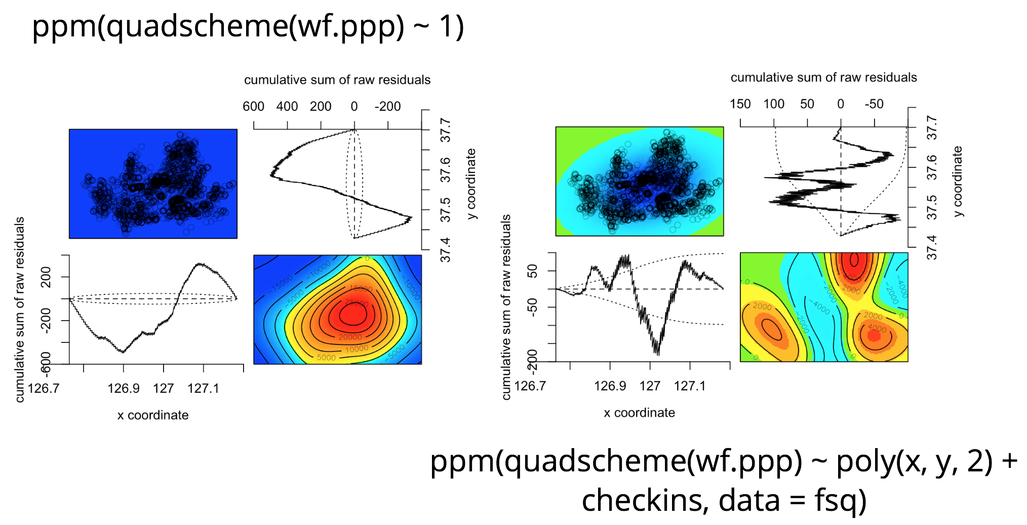
The diagnostic plot of the null model with no predictors looks quite awful compared to that of the final model. The sky blue colored "valley" we see on the lower right corner of the diagnostic plot of the final model refers to the Han river that goes through the center of Seoul which doesn't have any buildings or free public WiFis. To overcome this dip in the residuals, we can include geographical features such as elevations in the final model.
Results and Conclusions
- Free public WiFi locations in Seoul are clustered. How they are clustered is different across WiFi network providers and location types.
- Foursquare checkin data are quite useful. The best model is
ppm(quadscheme(wf.ppp) ~ polynom(x,y,2) + checkins, data = fsq)with no marks.